
Hint! This text only unfolds its full effect in color.
Colors are an indirect, personal world of experience. Depending on the light source and its wavelength, the surfaces reflects in unexpected colors. Blue light lets blue, red light red and yellow light lets yellow disappear. The unconscious processing of colors sometimes leads to surprising effects.
Experience the difference.
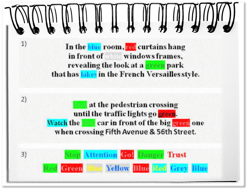
- Read section 1 of the illustration aloud!
The text can usually be read fluently. - Make a second attempt with section 2!
Although the lyrics have the same length, something is different. If you have not noticed the difference, read the two sentences again and pay attention to the required time. - Finally read the words in section 3 aloud!
Since we process the perceived colors unconsciously in another area than the conscious thoughts, you may have noticed some irritations – e.g. a faltering reading flow.
The influence of color takes place constantly – in every reading, in every picture, in every film, so in every artifact. For this reason it makes sense to be aware of these effects. The following colors are basic colors, which do not result from mixing colors, as for example green results from mixing blue and yellow 😉
(Attention! The following counts for many, but not for all.)
- Red
Red is a high-energy color – in a positive and a negative sense. It attracts attention and stimulates. For many it is attractive, arouses desire and passion and is usually attributed to love. At the same time it stands for aggression, danger and the forbidden.
Red is suitable, wherever interest should be awoken – as a hint or warning. - Yellow
Yellow is a disturbing color – with positive and negative symbolic effects. On the one hand it strengthens an optimistic mood, promotes creativity and prepares pleasure. On the other hand it represents jealousy and envy, poison and gall. Traditionally, pariahs were marked with yellow signs, such as the Jewish star.
Yellow is useful in a pleasant, life-affirming environment. In a not-so-positive context, it seems obtrusive. - Blue
Blue is the most popular color in Germany, although it does not affect quite emotionally. Its objectivity creates trust, reliability and strength – business images are predominantly bluish. At the same time, blue creates distance through its cool insensibility.
Blue is appropriate, when competence, reliability and calmness are to be conveyed.
Bottom line: The color enters the audience’s mind through the back door. The individuals do not notice that they are receiving additional messages via the sense of color. The effects described will not happen in everyone to the same extent or sometimes even quite differently – especially in other regions of the world. With the above examples, you could experience the normally unconscious effects. The three primary colors seldom appear in their pure form and our color perception may vary. Therefore, it is not possible to define a reliable programming guideline for the design of content. However, you should avoid certain gaffes (e.g. red for a Call to Act) in order not to undermine your message. Eventually, colors are the third gateway into the mind of the audience.