More than thousands of years, customers were met where they lived. Customer contacts took place on the market. The first mail-order catalogue was printed in the middle of the 19th century. Since then, new touchpoints for customers evolved. With the Internet we are today able to get in touch globally with everyone, as long as an Internet connection is available. As a result, one business model after the other is invented. In order to be able to convert every customer meeting into a business, good preparation is needed. The basis for this is a framework for the development of the Customer Journey: the stage for the customer contact.
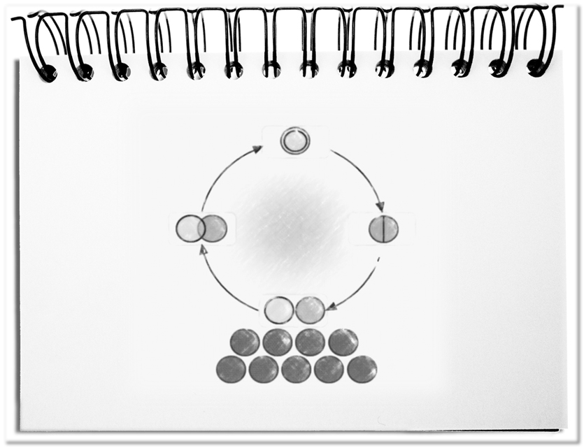
The following cycle creates the framework to synchronize the required paths of customers and affair. In the illustration, the sequence begins in the lower part.
- The Latency
Hidden in the latency are proposals that companies develop in advance in order to win the required number of buyership. Providers have to make efforts early on to show these quotations. The unintentional wandering of the senses perceives these things, but they are often not connected with meaning. The frequency of attention-seeking stimuli results in a kind of subconscious habituation of a deliverable. With the beginning of the next phase, the entry, this preload is released. - The Entry
The assortment develops an external effect that, at some point, attracts the attention of the customers. From now on, the deliverables will be noticed, but without any demand yet. At this moment possible uses, pros and cons, or the associated prestige should stimulate the longing. The desire grows subconsciously until one becomes aware of the need and comparisons are made with similar proposals. As soon as the decision has been made, the purchase is put into action and the next phase begins. - The Execution
Depending on the procured deliverable, it may involve the possession of an object or the use of a service. The first step is the setup – be it the installation or the consent on how the service will be provided. Then the usage starts – the pleasure of the service, the use of the new thing or simply the fun of looking at an object as one’s own satisfaction. The deliverables can be adapted within the term of the contract – other services are used; accessories are added; the thing is placed somewhere else. This occurs until the end of the contract term. - The Exit
Services are usually agreed for a certain period of time. If the perceived value continues to exist at the end of the useful life, it is highly probable that it will be extended before the end of the service time. If the opportunity to place alternative services has been missed, the business relation tends to come to an end. The exit is accelerated, if towards the end something does not function in the same way as it did initially. Things are often constructed in a way that it has a certain lifespan. If used properly, defects will only arise later. Now you have a good opportunity to sell your latest proposition. Satisfied customers will continue to build on the same brand. If a prestige object no longer provides the desired recognition, it ends up on the garbage or at best with the junk dealer. With the Exit the cycle ends and the original wishes and experiences disappear again in the subconscious – the latency.
The circle closes here. The proposals stay in the latency, until they’re revived. Thus, trends, tendencies and fashions are repeated with unpredictable intervals. With the arrow, leaving the latency left of the latency, the circular flow restarts.
Bottom line: This cycle is the framework that covers all life cycles of customers, users and suppliers. Whatever happens in the entry, the execution, the exit and the latency, is described in the respective Journey. The service framework provides the stage for all customer contacts.