
Manchmal ist es wie verhext. Nach Tagen hat man die Lösung für ein Problem gefunden. Die Prämissen sind ausführlich beschrieben, die Schlussfolgerungen passen alle zusammen und die Ergebnisse bauen auf den ursprünglichen Erwartungen auf. Alles führt zu einem nachvollziehbaren Ergebnis. Trotzdem kann das Publikum Ihnen nicht folgen. Vielleicht fehlt nur die richtige Form – das erste Tor in den Kopf des Publikums.
Auf den ersten Blick scheinen die vielen Formate, wie Artikel, Broschüren oder Präsentationen, keine durchgängige Form zu besitzen. Tatsächlich gilt für alle grundsätzlich ein ähnliches Schema, das sich auf die folgenden Aspekte reduzieren lässt.
- Titel reißen mit
Der schnellst Zugang zum Publikum ist der Titel. Im Zuge der Flut an Informationen, denen wir uns aussetzen müssen, fehlt die Geduld, um lange zu überlegen, ob die vorliegende Information es wert ist, Aufmerksamkeit zu investieren. Der Titel ist der Haken, der die Betrachter hineinzieht, abstößt oder im schlimmsten Falle zu keiner Reaktion führt. Je überraschender und neugierig machend ein Titel, desto wahrscheinlicher lässt sich das Publikum darauf ein. - Zusammenfassungen fesseln
Die zweite Hürde wird innerhalb der folgenden Minute genommen, in der die Betrachter so zu fesseln sind, dass sie auch die restlichen Informationen anschauen. In einem Text füllt die Zusammenfassung einen Absatz, indem alle wesentlichen Erkenntnisse so angekündigt werden, dass man sie überblickt, aber noch nicht abschließend kennt. In einer Präsentation findet sich die Zusammenfassung in der Kopfzeile einer Folie, die die wesentliche Aussage in einem Satz wiedergibt. - Zwischentitel leiten
Die Gliederung hängt vor allem von dem jeweiligen Inhalt ab. In jedem Fall ergeben sich Abschnitte, die aus mindestens einem Absatz bestehen. Die Betonung durch Zwischentitel hilft den Betrachtern, die vorliegende Seite schnell zu überfliegen und die Bereiche zu finden, die sie interessieren. Im Gegensatz zum Titel, der eher grundsätzliche Neugier wecken soll, folgen die Zwischentitel dem Thema. Sie sollten den nachfolgenden Inhalt möglichst verständlich ankündigen. - Absätze bündeln
In einem Absatz werden zwei bis drei Sätze zu einer Einheit zusammengefasst. Dem interessierten Publikum wird die Navigation durch die inhaltlichen Blöcke erleichtert. In Texten wird so ein schnelleres Querlesen ermöglicht. Auf Folien können die Zuschauer während der Präsentation die Folie schnell überfliegen und besondere Aufmerksamkeit auf den Teil richten, die sie am meisten interessiert. - Hervorhebungen signalisieren
Der kleine Bruder des Absatzes ist der Fett– oder Kursivdruck. Hier hebt der Autor einzelne Wörter hervor. Die Betrachter erhalten so schnell einen Überblick der wichtigsten Bestandteile der Sätze. Diese Hervorhebungen sollten möglichst selten genutzt werden, damit ihr Effekt nicht verpufft. In Präsentationen kann die Hervorhebung auch durch Farben erzeugt werden. Die Nutzung von Farben ist ein gesondertes Thema. Aber hier nur soviel: positive Aspekte mit Rot und negative Aspekte mit Grün zu markieren sendet meistens die falsche Botschaft; Außer: dies ist die Botschaft. - Listen erleichtern
Zusammenhängende Absätze, die ein Ganzes beschreiben, können am besten in Form von Listen wiedergegeben werden. Damit schafft man eine zusammenhängende Einheit, die sich schnell verarbeiten lässt. Dies kostet zwar Platz, aber die Leser honorieren diese Form, da sie sich die Inhalte besser merken können. - Bilder sind offen für Auslegungen
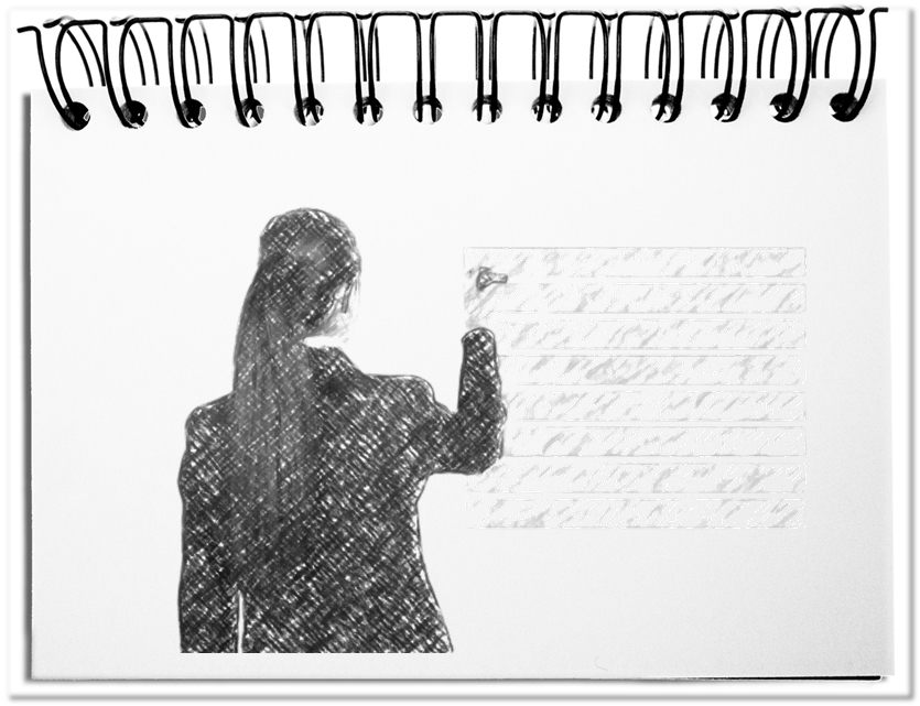
Eigentlich ist es trivial, aber ein Bild sagt immer noch mehr als Tausend Worte. Diese Wirkung kommt vor allem daher, dass die jeweilige Wortwahl, bei verschiedenen Personen verschiedene Assoziationen hervorrufen. Häufig führt das zu Missverständnissen, die sich aus den individuellen Lebenssituationen ergeben. Bei einem Bild findet der Einsatz von Worten unbewusst im Kopfe des Betrachters statt. Die Betrachtung eines Bildes erleichtert die Verknüpfung der Botschaft mit den eigenen Gedanken und Erfahrungen. Die Schlüsse, die sie dann daraus ziehen, sind in einem Kulturkreis eher gleich.
Fazit: Der Einsatz der obigen Elemente in Texten und in Präsentationen erleichtert dem Publikum das Verständnis der Inhalte. Wird die Betrachtung nicht durch einen formlosen Aufbau gestört, erreicht die eigentliche Botschaft das Publikum mit minimalen Widerständen.